Date Published: 17-Oct-2013 | By: Nancy R Jones
With abundant information available on Internet today, people do not hesitate to close your website and move to another, if they do not find information they are looking for on your website. According to Forrester research, 50% of potential sales are lost because users cannot find information on website and 40% do not return to websites because of negative experience during their first visit.
 Navigation is one of the most important elements of a website’s usability that guides visitors find information easily and quickly on your website. Good navigation not only encourages visitors to re-visit your website, but also is one of the key factors that search engines consider while ranking. Therefore, it is very important to design your website’s navigational structure in such a way that it offers good user experience.
To facilitate good navigation, consider the following things:
Enable back button for links
Usually links in many web pages open in a new browser window or tab. These links should have back button enabled. Otherwise, it will make it difficult for the users to realize where they are in the website and return to the previous page. Disabled back button doesn’t allow the visitors to go back to the earlier page and they tend to close the window and many times do not re-visit the website.
So, if you need to incorporate such links, then make sure you provide prominent action controls in that page to help users find the way back to the previous page.
Appropriate placing of navigation elements
According to a psychology study called “serial position effect”, first and last items on any list are very effective. Navigation is not an exemption here. In a horizontal list of navigational elements most important elements must come in the beginning or ending and the least important ones in the middle. Do not use same color, font and size as your body text for navigational elements – they should stand out.
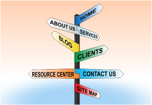
The most important and common navigational elements on website are Home, About us, Blog, Contact us, Search box, etc. These links direct users to learn, find and understand the information on the website.
According to KISSmetrics, 69% of user’s time on a web page is spent on left side of the page. So, try to place important links on left side of the page. In fact, top left side of your website is more prominent.
Create descriptive link/tab labels
Users generally like links that clearly define the function and destination. Make use of clearly defined tab or link label that helps users in selecting and reaching desired destination on your website. Otherwise, users may select wrong links, go to irrelevant page and get frustrated.
Following are the guidelines for creating link labels:
- Link text should be unique, meaningful and understandable
- Tab or link text should give a glance of what it is and where it is directing to (location)
- No two links in a web page should have same label as it can confuse both readers and search engines
Create list of headings for lengthy pages
77% of website visitors do not scroll down. This tells that visitors literally hate lengthy chunks of content. If you really need to provide lengthy content, then create a list of headings (that describes the page sections) provided with links on the top of the page to give a brief summary of that lengthy page. These links are called ‘within-page’ links. Providing these links helps users
- To know the outline of the web page
- Helps user to quickly navigate to the corresponding content (that may be somewhere bottom of the page) with just one click
Guidance on location
While browsing, users generally lose track of where they are in the site. In such cases, if you provide guidance on location to the users, they will understand where they are in the site and can continue for further activities without any hassle. Provide them with the feedback regarding their location using “breadcrumbs” and make sure that the hyperlink text matches with the heading of the page to make it more clear to the user.
Use Sitemaps
Users may find it difficult to know about your site if it has many pages. If you provide HTML site map in your website, users can clearly know about your site. Sitemap contains a table of contents of your website that enables user know about hierarchy of your website. It also helps search engines knew about the pages in the site and their prominence in the site
Hope, the above navigational elements help you while designing navigation for your website.
You may also like to read:
Elements of Good Web Page Layout
