Date Published: 05-Nov-2013 | By: Kerry K Robinson
‘Landing page’ or ‘lead capture page’ is one of the important web pages on your website where you want your visitors to land when they come to your site during their purchase process. They could be visitors from search results, banner advertisements, e-mail newsletter or from other websites. This article discusses about the types of landing pages and the qualities that make them ideal.
Types of landing pages
 There are two types of landing pages depending on their functionality. They include transactional and reference landing pages.
- Transactional landing pages are meant for persuading visitors to make the desired action. It could be making a purchase, filling a form or any other action that could lead to immediate or eventual sale. When they are used to collect the information of the customers they are called as lead capture pages.
- Reference landing pages, on the other hand, furnish relevant information to visitors. These come in the form of images, text or relevant links.
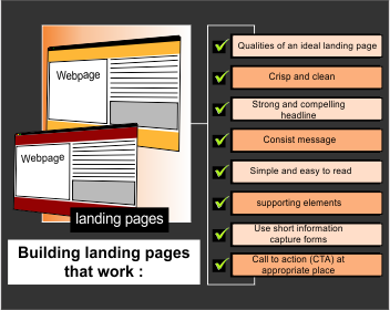
Qualities of an ideal landing page
According to MarketinngSherpa, 79% of marketing leads are not converted to sales due to poor design of landing pages. If designed properly, landing pages can be powerful means of conversions. So, in order to do that, you need to know the elements that make landing pages effective.
To make your landing page a powerful lead generator, you need to make sure that it has all the critical components. These include a good headline, description about the offer/product/service; form to capture visitors’ information, call-to-action buttons like ‘buy now’, ‘add to cart’, etc.
Crisp and clean
You should clearly know the objective of your landing page. Project the same in a simple way so that visitors understand the purpose of the landing page immediately. Keep your landing page clean by avoiding unnecessary options and make it easy to follow the desired outcome. Visitors will get distracted if you keep too many options on the landing page.
Concentrate more on the important Content on the Page like the headline, description of the offer or product, call to action buttons, etc.
Strong and compelling headline
The headline is the first thing on the landing page that attracts the attention of the visitors. It is a crucial element of the landing page. It should be strong and compelling to make the visitor read the description. It should be catchy and concise and should tell what the visitor will be reading in the page. According to Unbounce, there are 79% of marketers that are testing headlines on the landing page. They are very particular about the headlines and have reported better conversion rate using compelling headlines.
Consistent message
When a visitor lands on the landing page via email, PPC ad, or from other website, the message on the ad should exactly match with that on the landing page. For instance, if you offer 15% discount on any product on your PPC advertisement, then the description on the landing page should also read the same product and offer same 15%.
Otherwise, visitors may feel that they have entered a wrong page and may close the page or go back. Your website will lose credibility among the visitors. It also increases bounce rate of your site, which directly impacts the rankings.
Simple and easy to read
The content/description on the landing page should be simple and easy to read. Try to emphasize the value and benefits offered by the product/service. Don’t focus much on describing a product/service and its features. It should convince visitors and help them in quick decision making, further prompting them to take the desired action.
Supporting elements
Supporting elements on the landing page like the product images, how-to-use videos, customer testimonials, money back offers, etc., are always convincing and appealing to the visitors. According to Eyeview, landing pages with videos have 86% higher conversion rate than those without videos. Include supporting things that are likely to influence visitors’ decision making.
Use short information capture forms
If your landing page includes information capture form, which is otherwise called as lead capture form, make it as simple as possible and short by asking only the required information. Short forms enable the visitors to show interest in filling. According to Impact Branding and Designing, the ideal number of fields in information capture form is 3. However, this number may vary with the business and kind of product/service you are offering.
Call-to-action (CTA) at appropriate place
The entire goal of the landing page is to make the visitor complete a desired action. So, the final conversion button or ‘call-to-action’ should stand out. Color of the CTA button also matters. It is important that CTA should be kept at the prominent place on the page. Then only it will catch the visitors’ attention and prompts them to click on it. It is recommended to have only one call-to-action on a landing page to increase conversion rate.
Hope this article helps you in designing an effective landing page. However, if you are a newbie, take the help of Professionals.
